What is Color Harmony?
Color harmony is the principle of combining colors in a way that's aesthetically pleasing to the eye. It helps you build cohesive designs that feel balanced, whether you're creating a website, logo, or graphic art.
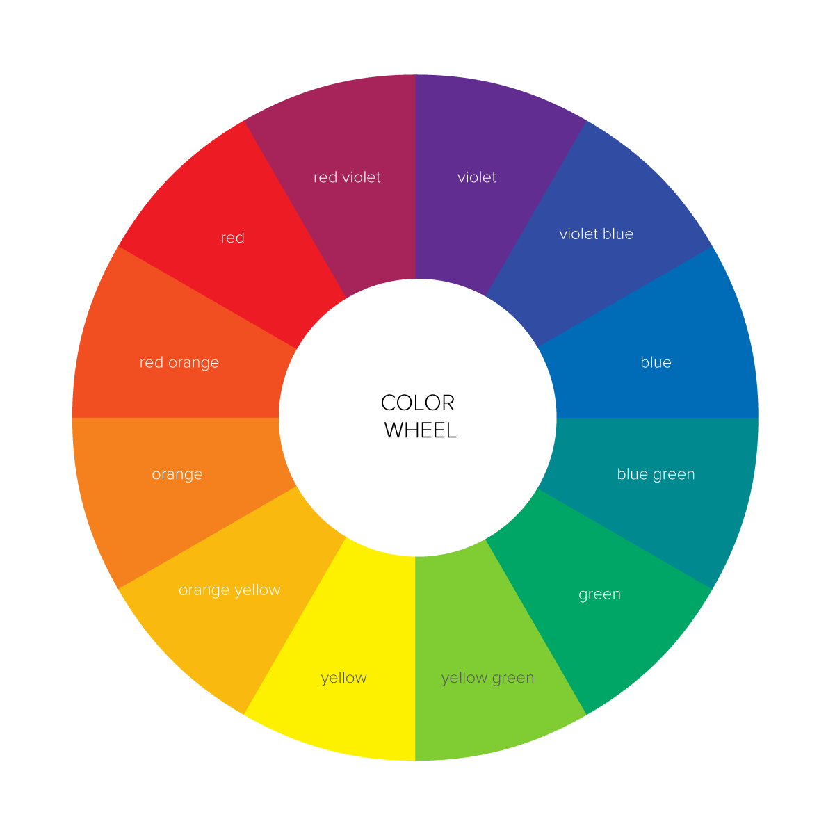
It's based on color theory and the color wheel, which has guided artists and designers for centuries.
Why Does Color Harmony Matter?
- Creates balance and unity in design
- Highlights important elements (CTAs, headings)
- Helps with brand recognition and emotional response
- Aids accessibility and readability
Types of Color Harmony
Let's break down the most popular harmony rules you can explore using tools like ColorPeek:
Complementary Colors
- Colors directly opposite each other on the color wheel
- Example: Blue and Orange
- ⚡ High contrast, great for calls to action and logos
Analogous Colors
- Three colors side-by-side on the color wheel
- Example: Red, Orange, Yellow
- 🔥 Soft, soothing, ideal for natural, harmonious designs
Triadic Colors
- Three colors evenly spaced around the wheel
- Example: Red, Blue, Yellow
- 💥 Vibrant and energetic, best for playful or creative brands
Split Complementary
- One base color + two adjacent to its opposite
- Less tension than pure complementary, but still punchy
Monochromatic
- Variations in lightness and saturation of one hue
- Elegant, minimalist, and often calming
Use ColorPeek to Find Perfect Harmonies
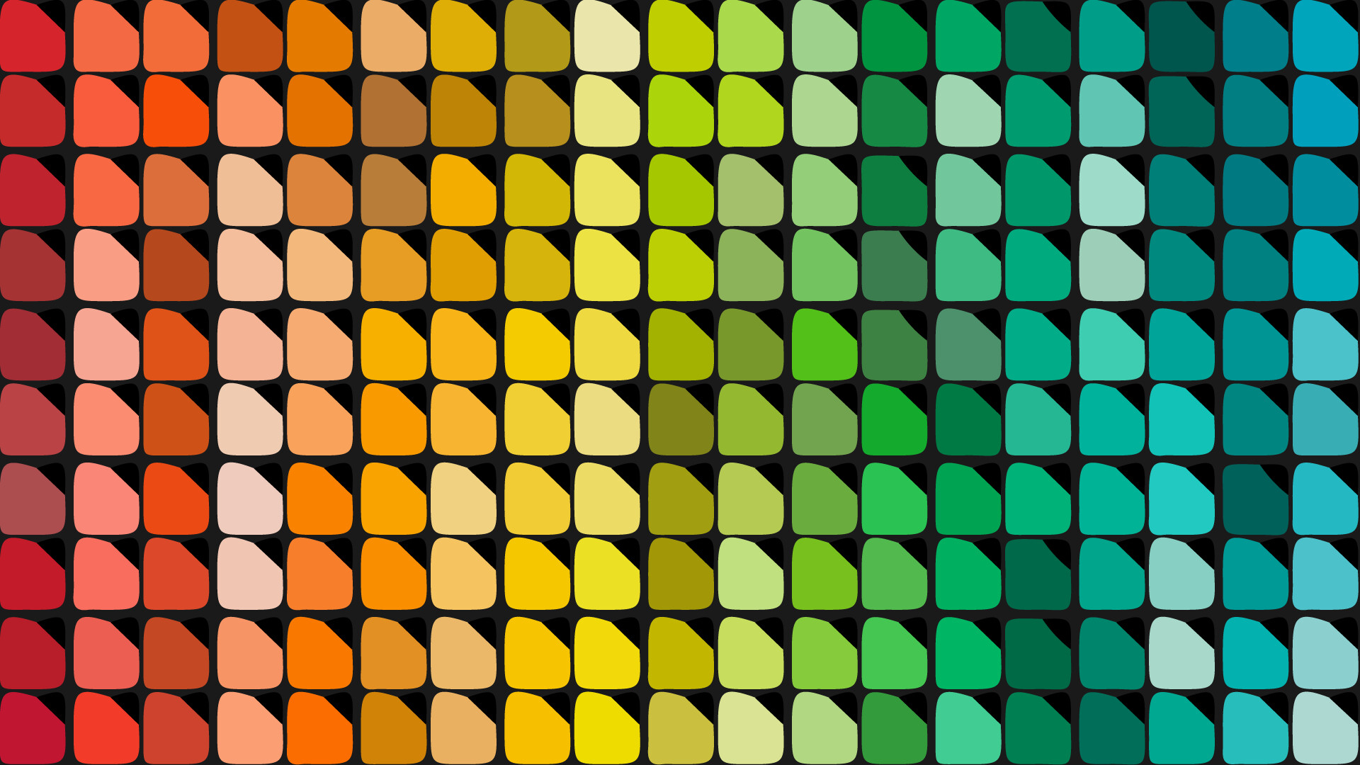
ColorPeek offers harmony suggestions automatically when you extract colors from an image. It helps you visualize:
- Analogous blends from a photo
- Complementary pairs that pop
- Triadic layouts for branding
And bonus — it checks contrast accessibility automatically!
Best Use Cases for Each Harmony
| Harmony Type | Best For |
|---|---|
| Complementary | Buttons, CTAs, logos |
| Analogous | Backgrounds, gradients, mobile UIs |
| Triadic | Landing pages, vibrant themes |
| Monochromatic | Minimalist sites, portfolios |
| Split Complementary | Balanced yet bold branding |
FAQs
Q: Can I use these harmony rules in Figma or Canva?
Yes! Use the HEX codes provided by ColorPeek in your design tools easily.
Q: How do I know if the colors are accessible?
Use ColorPeek's built-in contrast checker to ensure readability for all users.
Q: Can I download my harmonies?
Absolutely. You can copy the codes or export palettes directly.
Final Thoughts
Understanding and applying color harmony will take your designs to the next level. You don't need to memorize complex color theory — just pick your image, and let ColorPeek do the work.
Ready to explore color harmonies?
Try ColorPeek now and discover the harmony behind every hue!
Try ColorPeek Now