Color is one of the most powerful tools in a designer's arsenal. It can influence mood, create visual hierarchy, convey meaning, and elicit emotional responses. Understanding color theory is essential for creating effective, compelling designs that connect with your audience.
In this comprehensive guide, we'll explore the fundamentals of color theory, how to apply these principles in your design work, and practical tips for creating harmonious color schemes that enhance your projects.
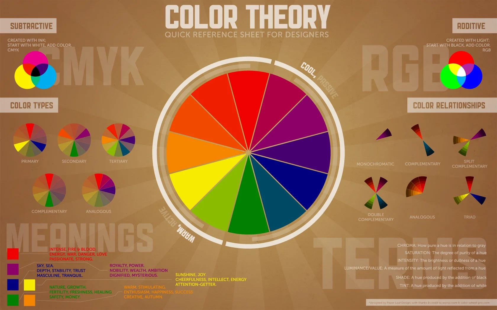
The Basics of Color Theory
Color theory is both the science and art of using color. It explains how humans perceive color, how colors mix, match or contrast with each other, and the visual effects they create. At its core, color theory centers around the color wheel and the relationships between colors.
Primary, Secondary, and Tertiary Colors
The traditional color wheel is built from three primary colors that can't be created by mixing other colors:
- Primary Colors: Red, Blue, and Yellow
- Secondary Colors: Created by mixing primary colors – Green (blue + yellow), Orange (red + yellow), and Purple (red + blue)
- Tertiary Colors: Created by mixing primary and secondary colors – like Red-Orange or Blue-Green
Red
Blue
Yellow
Color Properties
Every color has three main properties:
- Hue: The pure color itself (e.g., red, green, blue)
- Saturation: The intensity or purity of a color
- Value/Brightness: The lightness or darkness of a color
Color Harmonies
Color harmonies are pleasing arrangements of colors that work well together. Here are some common color schemes:
Monochromatic
Variations in lightness and saturation of a single color. These create a cohesive, harmonious look that's easy to manage.
Complementary
Colors that are opposite each other on the color wheel. These create a high-contrast, vibrant look.
Analogous
Colors that are adjacent to each other on the color wheel. These create a harmonious, comfortable look.
Practical Applications in Design
Understanding how to apply color theory to real-world design projects is where the true value lies. Here are some practical tips:
Creating Visual Hierarchy
Use color to guide the viewer's eye through your design. More saturated, brighter colors will naturally attract attention first, while muted colors recede into the background.
Conveying Meaning and Emotion
Colors carry cultural and psychological associations. For example:
- Red: Energy, passion, danger
- Blue: Trust, calm, stability
- Green: Growth, nature, prosperity
- Yellow: Optimism, clarity, warmth
- Purple: Creativity, royalty, wealth
Ensuring Accessibility
Always consider color contrast for readability. The Web Content Accessibility Guidelines (WCAG) recommend a contrast ratio of at least 4.5:1 for normal text and 3:1 for large text.
Tools like ColorPeek's contrast checker can help ensure your color combinations meet accessibility standards.
Using ColorPeek for Color Theory Applications
ColorPeek's features make it easier to apply color theory principles to your projects:
- Extract dominant colors from any image to discover natural color palettes
- Generate complementary, analogous, and other color harmonies automatically
- Check contrast ratios for accessibility compliance
- Get color code syntax for various programming languages
Conclusion
Mastering color theory takes practice, but understanding these fundamentals will significantly improve your design work. Remember that while there are scientific principles at play, color is also subjective and contextual.
Use the guidelines presented here as a starting point, but don't be afraid to experiment and develop your own color intuition over time. The most effective color choices ultimately depend on your specific audience, brand, and communication goals.
Ready to experiment with color?
Try ColorPeek's advanced color extraction and manipulation tools to apply these color theory principles in your next project.
Try ColorPeek Now